Announce switch checked state on list row focus for screen readers#86246
Announce switch checked state on list row focus for screen readers#86246
Conversation
When a list row contains a Switch as its rightElement, screen readers
now announce the switch's on/off state when the row is focused. This
is done generically in BaseListItem by detecting the Switch's isOn
prop from the rightElement and including it as the checked state in
the row's accessibilityState.

Co-authored-by: Rushat Gabhane <rushatgabhane@users.noreply.github.com>
|
@MelvinBot it should work for other pages too. also clean the code. create props if needed etc |
Codecov Report❌ Looks like you've decreased code coverage for some files. Please write tests to increase, or at least maintain, the existing level of code coverage. See our documentation here for how to interpret this table.
|
…tElement

Replace fragile React element prop inspection with a typed isToggleActive
prop on ListItem. This fixes wide layout pages (Categories, Tags) where
the Switch is nested inside a Fragment, and provides a clean API for all
pages to declare their toggle state for screen reader announcements.

Co-authored-by: Rushat Gabhane <rushatgabhane@users.noreply.github.com>
|
Addressed the feedback — here's what changed: Cleaned up the approach: Replaced the fragile Now works for all pages, including wide layout where the Switch is nested inside a Fragment (Categories, Tags):
What changed:
|
|
@MelvinBot use web agent and test the PR verify from DOM please |
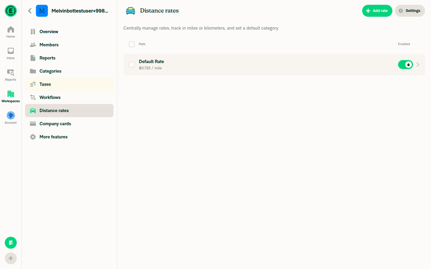
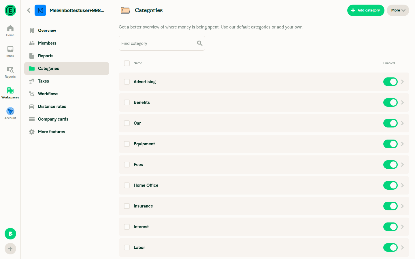
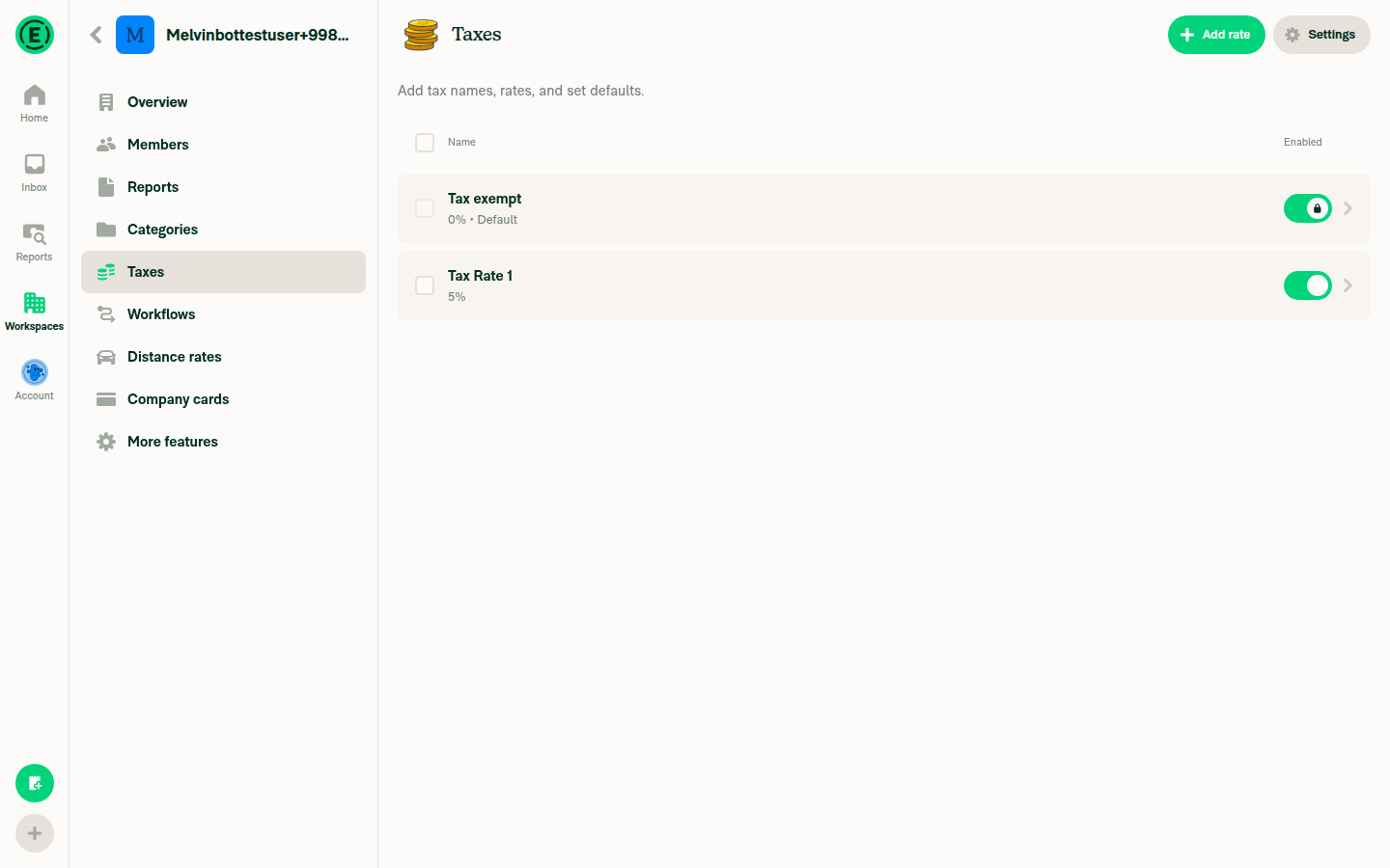
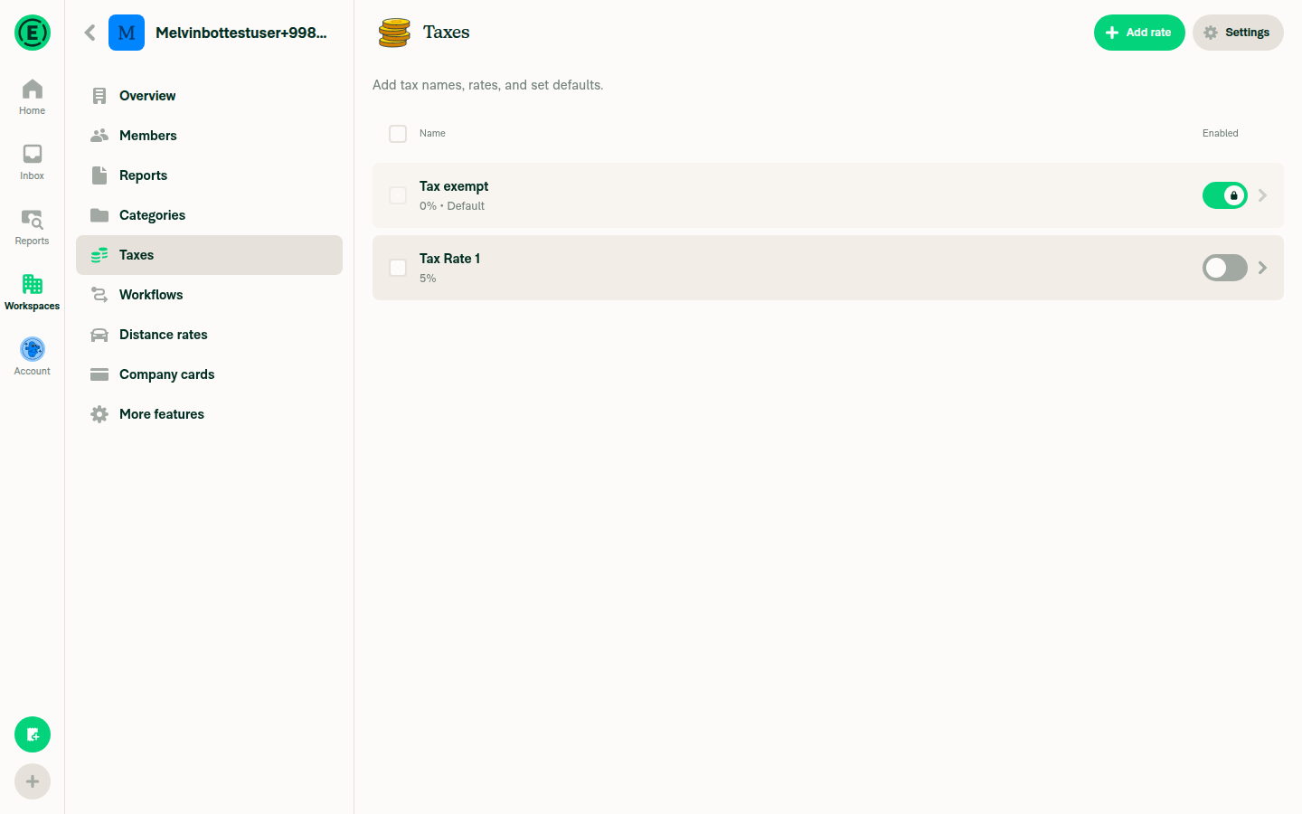
🧪 Browser DOM VerificationTested the PR on web using browser automation. Verified that Distance Rates
Categories
Taxes
SummaryThe |
|
@MelvinBot review |
Code ReviewThe refactored approach using an explicit What looks good:
One thing to note (not blocking): When Housekeeping: The PR description still references the old approach ("detect if the rightElement is a Switch by checking for its isOn prop"). It should be updated to reflect the current |
|
[aria-checked="true"] @MelvinBot isn't that the checkbox and not the toggle switch? |
…ce on/off

aria-checked on role="option" makes screen readers say "checked/not checked"
(checkbox semantics). Using role="switch" makes them correctly say "on/off".

Co-authored-by: Rushat Gabhane <rushatgabhane@users.noreply.github.com>
|
Good catch — you're right. Fixed: The row now uses The Switch component itself ( |
@MelvinBot is the root cause fixed then? |
|
Yes, the root cause is fixed. Here's the full picture: Root cause: What the fix does (in
The screen reader now announces both the row's text content AND the switch state when focusing the row. |
Co-authored-by: Rushat Gabhane <rushatgabhane@users.noreply.github.com>
|
Fixed the failing ESLint check: replaced a nested ternary expression with an if-else block in |
|
hmm but a list item can have both toggle and switch @MelvinBot |
When canSelectMultiple is true, rows have role=checkbox. The toggle role
override should not replace it — checkbox state (isSelected) takes
priority over toggle state (isToggleActive) in multi-select mode.

Co-authored-by: Rushat Gabhane <rushatgabhane@users.noreply.github.com>
|
Good catch — fixed. When if (hasToggle && !isCheckboxOrRadio) {
effectiveRole = CONST.ROLE.SWITCH;
}So in multi-select mode, the checkbox role and selection state take priority. The |
2 participants
Explanation of Change
When a list row contains a Switch as its
rightElement, screen readers (like VoiceOver on macOS) only announced the row's text content (e.g., "Default Rate, $0.67 / mile") but NOT the switch's on/off state. This affected all 6 workspace pages that use Switch in list items (Distance Rates, Categories, Tags, Taxes, etc.).This is a generic fix in
BaseListItem.tsx. In thegetAccessibilityPropsfunction, we now detect if therightElementis a Switch (by checking for itsisOnprop) and include its checked state in the row'saccessibilityState. This causes the screen reader to announce the switch state when the row is focused, without requiring any per-page changes.Fixed Issues
$ #82498
Tests
Offline tests
N/A — This is an accessibility announcement change with no network dependency.
QA Steps
PR Author Checklist
### Fixed Issuessection aboveTestssectionOffline stepssectionQA stepssectiontoggleReportand notonIconClick)src/languages/*files and using the translation methodSTYLE.md) were followedAvatar, I verified the components usingAvatarare working as expected)StyleUtils.getBackgroundAndBorderStyle(theme.componentBG))npm run compress-svg)Avataris modified, I verified thatAvataris working as expected in all cases)Designlabel and/or tagged@Expensify/designso the design team can review the changes.ScrollViewcomponent to make it scrollable when more elements are added to the page.mainbranch was merged into this PR after a review, I tested again and verified the outcome was still expected according to theTeststeps.Screenshots/Videos
Android: Native
Android: mWeb Chrome
iOS: Native
iOS: mWeb Safari
MacOS: Chrome / Safari